
A product catalogue sounds simple enough: here are the things we offer, pick what suits you. But when your product universe spans cash management, globally diversified portfolios, income solutions, and private markets, “here are the things we offer” stops being a solution and starts being a problem.
That was where we found ourselves when we set out to redesign Explore, Endowus’s product discovery page, in early 2025.
Three things clients kept getting stuck on
Explore had been live since September 2023. On Explore, clients can browse the full Endowus universe of offerings, which was genuinely useful. But feedback from our Client Experience team had been building for a while, and there were three main problems:
1. The page was hard to navigate, with a mix of horizontal and vertical scroll
2. Fund Smart was buried at the bottom and difficult to find
3. Clients looking for private market funds kept missing them entirely
It was pretty clear at this point that our wide collection of offerings was the core problem. Our layout was strained, and people were having a hard time understanding and finding things, because we just had so many solutions to show.
So, how might we redesign Explore to make it meaningful to people, so it’s easy to understand and useful to clients?
Three ways to organise a product universe
Once we had a clear brief, we ran into the real challenge: how do you organise a product universe that spans completely different investment types, time horizons, and client profiles?
I brought the working team together with our CEO to discuss three potential frameworks: 4Ls, Intents, and Slice & Dice.
4Ls — Liquidity, Lifestyle, Longevity, Legacy
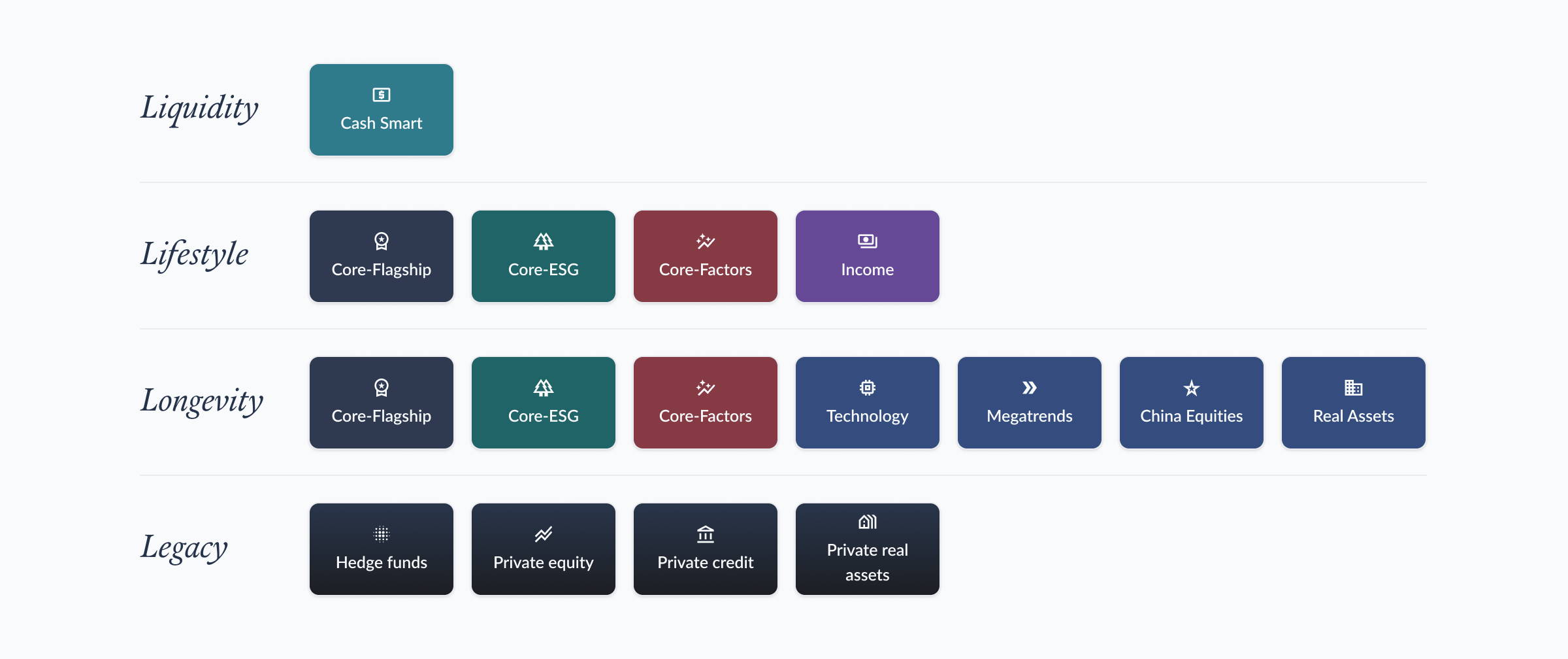
4Ls is a framework we use to advise clients on their life goals. It stands for Liquidity, Lifestyle, Longevity and Legacy, and represents the 4 types of life goals across different time horizons. In our discussions, we found that while 4Ls is a powerful framework to guide people to think about their life goals, it made for a messy product catalogue. That’s because it causes duplication of offerings — Core-Flagship appeared under Lifestyle, Longevity, and Legacy, because it applied to these time horizons.
Intents — Savings, Wealth, Income, Thematic
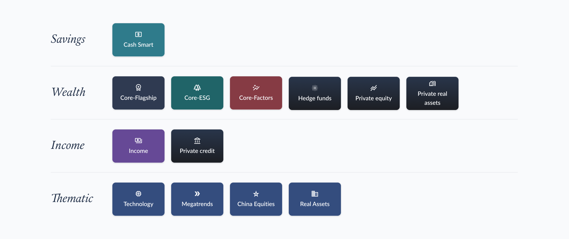
Intents, on the other hand, represent how different offerings fit into clients’ needs. We mapped out 4 main intents: cash management, general investing, income, and satellite, which cleanly maps to our product offerings.
Slice & Dice — Explore by 4Ls, Intents, Liquidity, and more
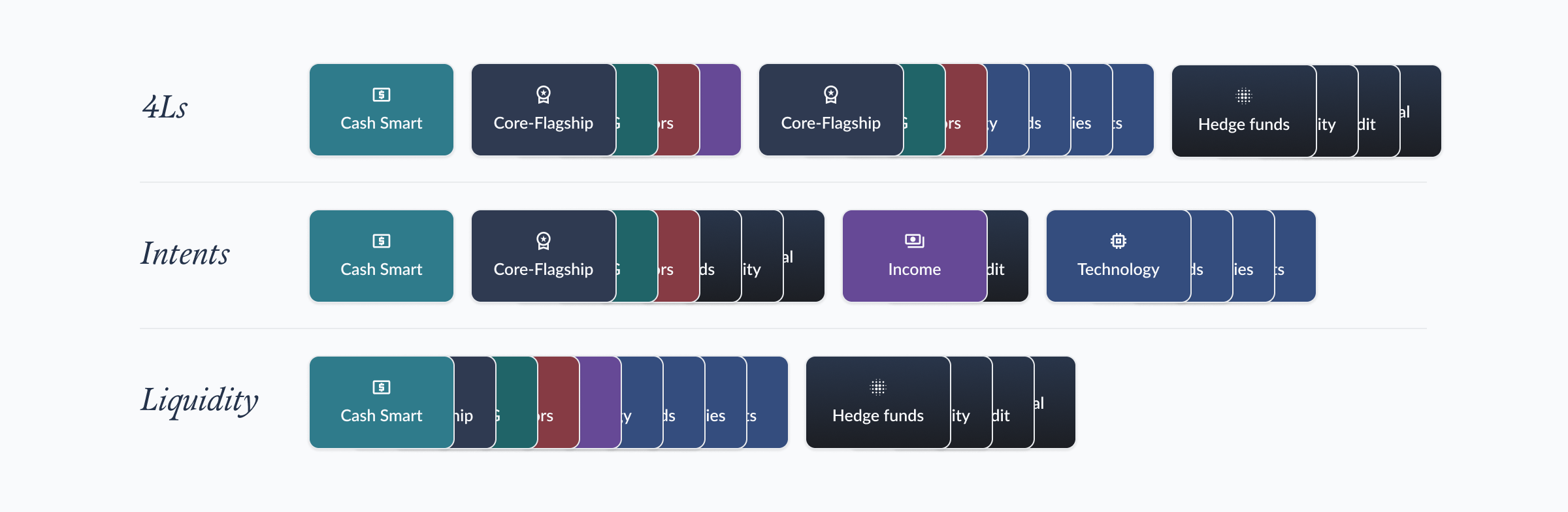
Slice & Dice is a mix of the above, and more, offering multiple ways for clients to explore our catalogue. While comprehensive, it can be sprawling and thus intimidating to browse through.
After some debate, we decided that Intents was the most promising framework as it maps nicely into a product catalogue experience. It felt like we could finally see the light at the end of the tunnel.
How we de-risked our strategic bet
Agreeing on the framework was the easy part, as it turned out.
We still had a range of design questions to work through: how to position private markets, how to expose CPF and SRS as funding sources, how to make Fund Smart discoverable without it getting lost again, and so on.
And the thing is, there were a thousand and one ways to design for an Intent-based Explore experience. Every one on the team (and more outside the team) had a slightly different idea of what made the most sense.
So we needed to de-risk our direction.
We created mid-fidelity mocks using Figma (this was before AI-assisted prototyping was a reliable method) and ran some user testing. We wanted to validate the following:
- Were the intents easy for people to understand?
- Could DIY clients find Fund Smart quickly?
- Did users grasp the breadth of our offering, from advised portfolios to individual funds?
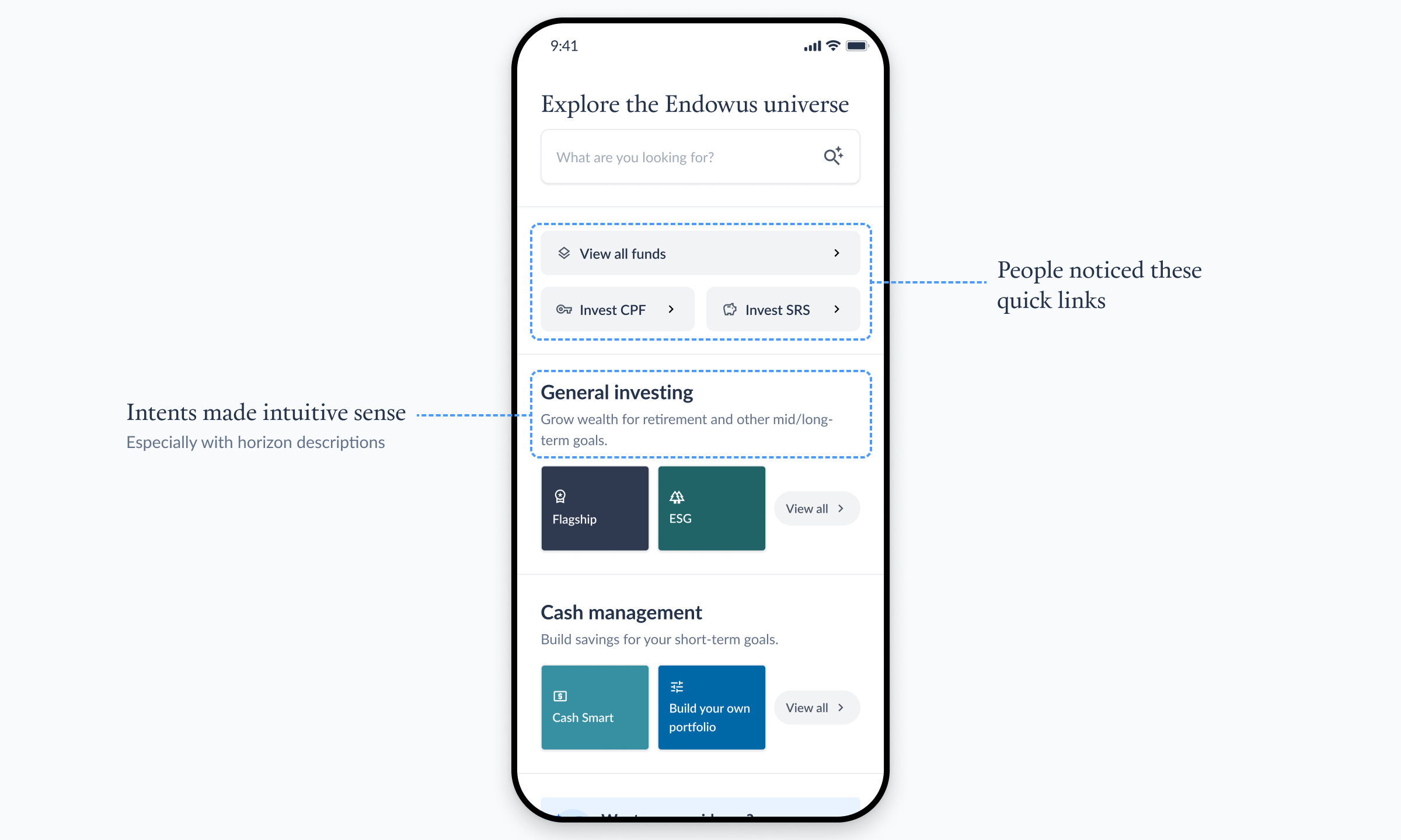
The good news? We found that intents made intuitive sense to clients, and they especially found the time horizon descriptions next to each intent helpful in distinguishing them. Fund Smart and CPF/SRS quick links at the top were also clearly visible, and clients no longer had to scroll to find them.
We also found areas for improvement.
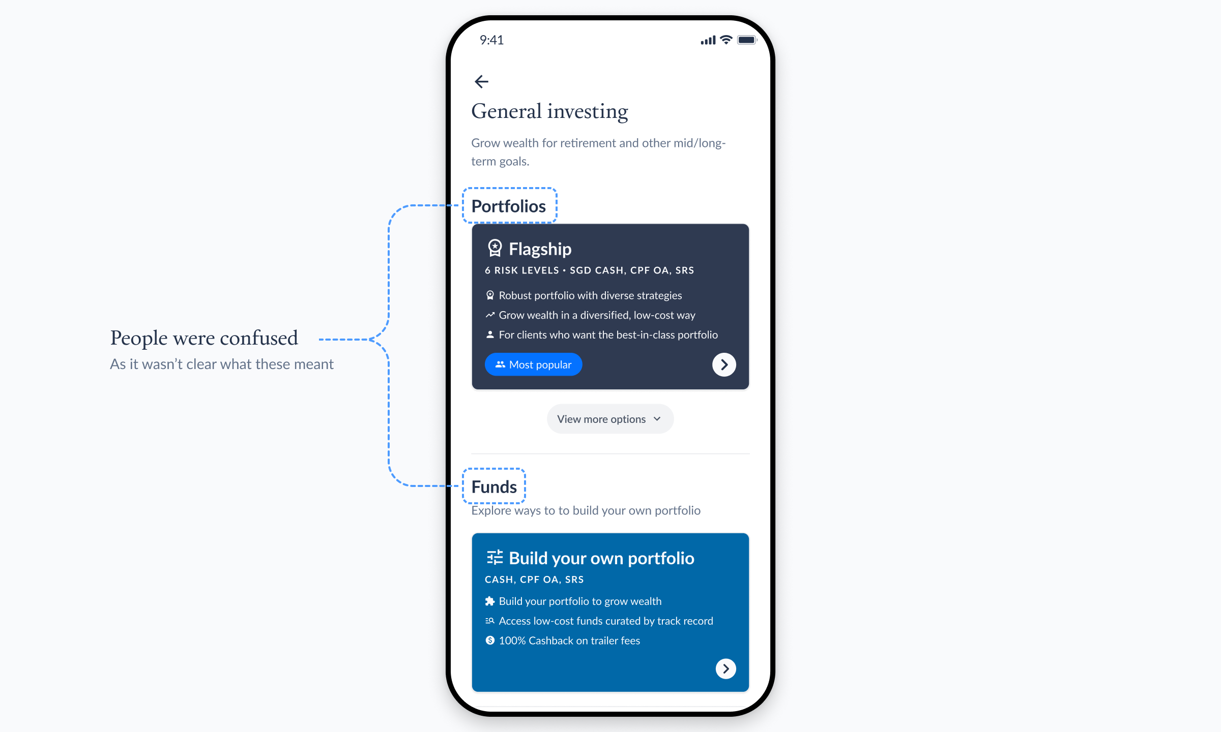
Initially, we organised each intent’s page into “Portfolios” where we showed our advised portfolios and “Funds” where we showed Fund Smart. We thought that’s the easiest way to describe our offerings, but it turned out that not everyone understood what a “portfolio” meant and how it differs from a “fund”.
Based on this, we renamed the sections to “Portfolios by Endowus” and “DIY portfolio” instead — there’s now no need to understand what “portfolio” meant as opposed to “fund”.
What’s in a name?
One question we spent a surprising amount of time on was what to actually name the intents.
We had two schools of thought. The first was to use technically correct terms like “General investing”, “Cash management”, “Income”, and “Satellite”. These were specific and accurate, but we’re not sure if people could understand what they meant. The second was to use simple terms — “Wealth”, “Savings”, “Income”, and “Thematic”. We thought these were easier to understand, although they might be too generic.
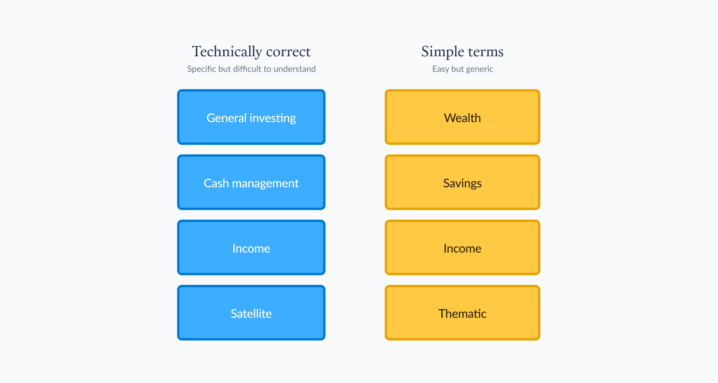
We couldn’t decide internally which one made more sense. And when in doubt, we asked clients. We found that clients really didn’t understand what “Satellite” meant. They also didn’t understand how “Wealth” and “Savings” are different things — don’t I invest my savings to build wealth?
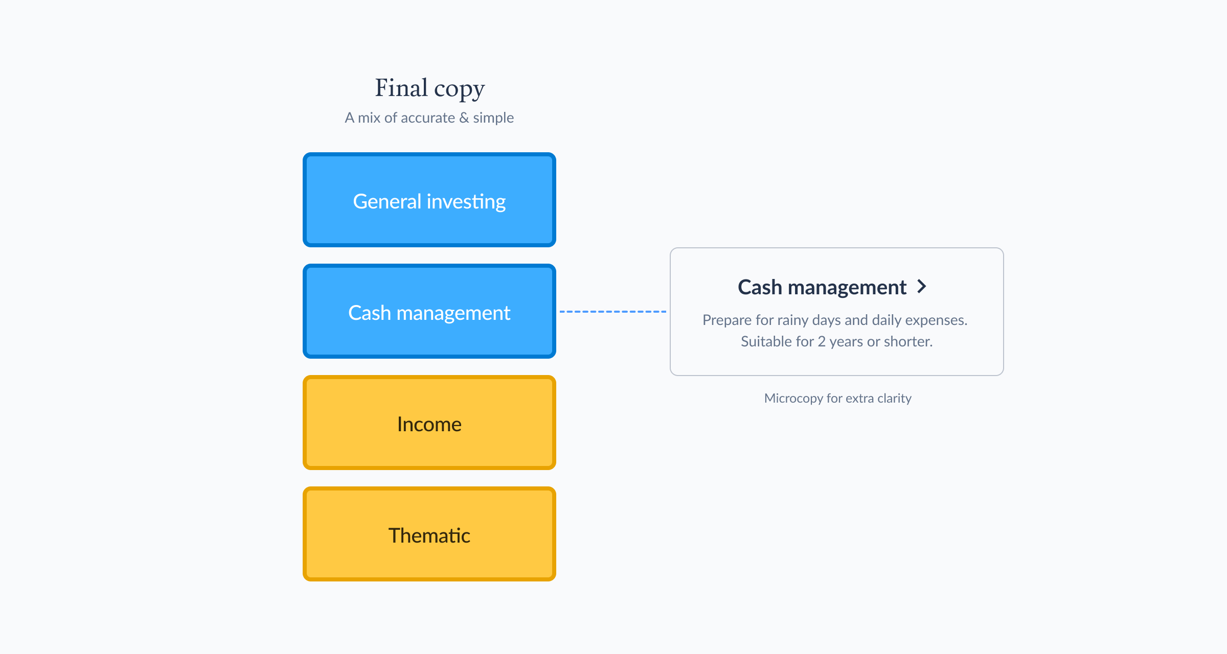
In the end, we landed on a mix of the 2 approaches and named our intents “General investing”, “Cash management”, “Income”, and “Thematic”. This makes every intent distinct from one another, while keeping things as simple as possible. We paired each intent name with a short description that did the heavy lifting: “Prepare for rainy days and daily expenses. Suitable for 2 years or shorter.”
The jam that shaped our visual language
With the information architecture and naming settled, we needed to figure out how it should actually look.
The design team — Esther, Miko, Glads and Yu Siang (me) — got together for a jam session in a shared Figma file. The brief was open: given the intent-led structure we had agreed on, how might we organise the visual layout of Explore?
What emerged from that session was a shift in visual direction that stuck all the way to launch. Rather than a dense, feature-heavy layout, we started gravitating towards something more editorial, magazine-inspired, with more whitespace and a stronger typographic hierarchy.

That jam was the starting point for the visual language of the final design. I built on the fanned-out cards idea we had and created a fanning-out Lottie animation of product tiles on entry, which reinforced the editorial feel and gave the page some movement without making it feel busy.
How we changed the way clients invest
We launched the new Explore in August 2025, and our data shows that the new design has successfully shifted clients’ behaviour.
Comparing a 4-month period before and after the redesign, goal creation conversion rate rose from 21% to 30%. Clients who viewed products were more likely to go on and create an investment goal than they had been with the old design. The new layout had done its job: it was clearer what you were looking at, and clearer what to do next.
The new Explore design showed us that when people understand their options, they make different, and better, choices.